“Teha’mana Has Many Ancestors” by Paul Gauguin: A Digital Restoration

I have recently been re-engaging scholarship on Paul Gauguin, in part because I have been making the final corrections to my book, Gauguin’s Matriarchy, soon to be released through Cambridge Scholars Publishing! 📖 🎉 This is the first of my books that will be released through a non-Ediciones Pluma Verde publisher, so I am doubly excited about its upcoming publication.1

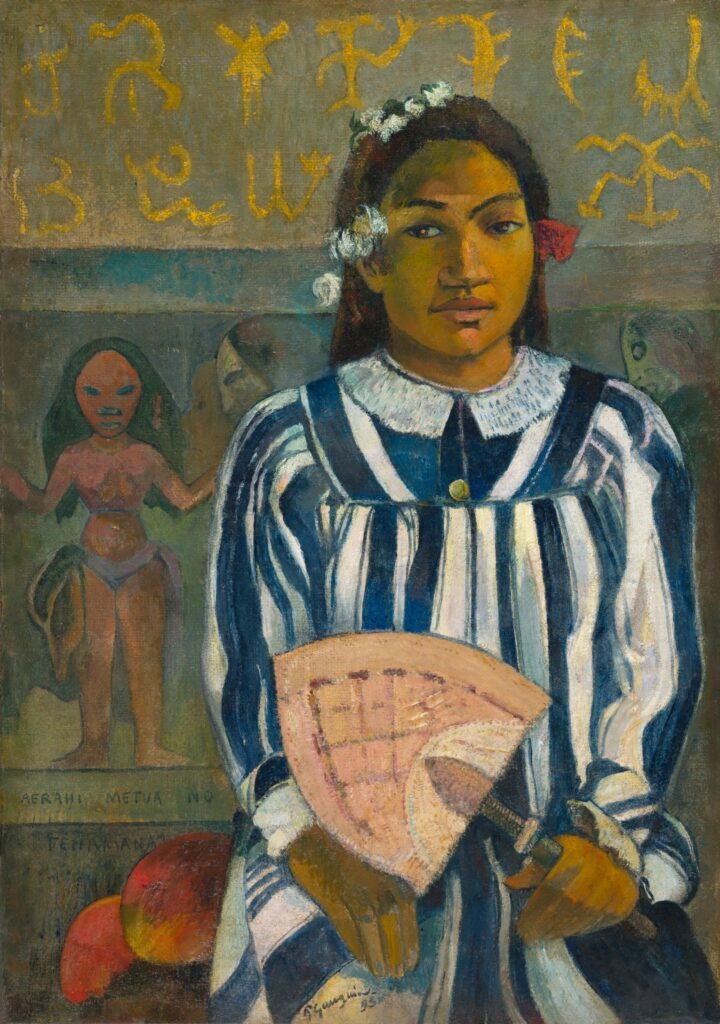
Anywho, as I have been making revisions and reviews, I stumbled upon Gauguin’s Teha’mana Has Many Ancestors (1893), an oil on jute (sackcloth) painting of his first Tahitian companion. Gauguin completed this painting during his initial sojourn to French Polynesia—an archipelago famously visited by Captain James Cook in 1767. Though not without the usual share of conflict, during their months-long stay in Tahiti, Cook’s crew ate, hung out, and traded with the locals with some success. When the time came for departure, one of the locals, an areoi named Tupaia, decided to join Cook in his oceanic charting mission.

As a holy man who followed the cult of Tane (though some also say Ta’aroa), Tupaia was responsible for sharing and preserving the oral tradition of the Society Islands through the extensive memorization of chants, myths, language, and multiple navigational systems for extensive intra-Pacific travel. Polynesians were exceptionally adept seafarers who traveled the Pacific in large canoes, reaching as far as Rapa Nui (Easter Island) and New Zealand onwards the 10th century. As such, they share many elements of the culture, to such an extent that Tupaia had no problem communicating with a Māori chief during their voyage to New Zealand, even though he had never been to the island.2

In Noa Noa, a semi-fictionalized (if not occasionally symbolic) account of his first visit to Tahiti, Gauguin shares how he met Teha’mana during an expedition to the center of the island, led in search of a native wife. Some scholars have argued that she was an artistic invention, though Teha’mana’s existence has been proven through photos and accounts revealed to the anthropologist Bengt Danielsson, later documented in Gauguin in the South Seas. Danielsson regarded Gauguin’s love for Teha’mana as “anthropological,” driven by his social-cultural (and increasingly political) curiosity for Tahiti. Danielsson’s theory is partially supported in Noa Noa, where Gauguin explained that he strove “to see” through Teha’mana’s eyes. In various instances he also places Teha’mana as the source of his mythological knowledge, even though scholars argue that Teha’mana could not have known these myths to the extent described by Gauguin. Still, the fact that he chose to regard her as an authority is true to the “matriarchal” character of the culture, who once argued that the moon was a woman’s first husband.3

Teha’mana Has Many Ancestors seems to allude to all of these events through the myriad symbols in the composition. Her fan is Samoan and the glyphs in the background are based on the rongorongo carved script invented by the Rapanui in Easter Island. The Rapanui were the only Polynesians who invented a writing system, so their creation is at once mysterious and intriguing. These glyphs in particular correspond to the Tahua tablet, sent to Paris by Tepano Jaussen, Bishop of Tahiti, in the 1880s, after attempting to decipher the wooden glyphs with little success. Though Gauguin could not have seen the tablet in Tahiti, he did gain access to a photograph during the International Exhibition of 1889. In any case, both Jaussen and Gauguin copied glyphs from the tablet—the former for scholarly purposes, the latter for Teha’mana’s portrait.4

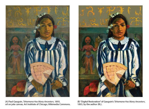
To commemorate this wonderfully symbolic painting, I decided to “restore” the rather faded digital copy available in the Public Domain. Mostly, I was struck with a great curiosity for how the painting must have looked after completion. Due to Gauguin’s penchant for color, Teha’mana Has Many Ancestors must have looked quite vivid during its original years. Armed with some (perhaps rather good) knowledge of Gauguin’s working palette, I set off to retouch the portrait in good ol’ Adobe Photoshop 2026, using an RGB profile. Edits were, for the most part, actual digital brushstrokes in teal, beige and copper, occasionally texturized to preserve some of the existing character of the canvas. Opacity and layers were adjusted to create the desired outcomes as needed.

And so the image went from that (… a still pretty good photo replica of the painting):
… to this (hopefully accurate, vivid “digital restoration”):
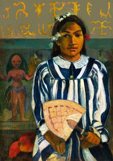
Using the “color picker” tool, colors were sourced from the edges of the corresponding design element, because they seemed to be the most intense and well-preserved. Thus, the stripe behind Teha’mana’s head is now more vividly and uniformly teal, and the “frieze woman”’s hip covering is now slightly more lavender.

Hopefully this updated photo can improve digital study of the painting. I for one love how it came out! I like to think that Gauguin would approve. It seems to be noticeably brighter without sacrificing integrity of hue, and the saturation is fairly realistic and balanced for a Gauguin painting.

Let me know what you think! You can send comments to hello@robmarielopez.com.

Updates on Gauguin’s Matriarchy to follow!


  1. Which… nothing wrong with that. We strive for quality! But it’s cool to have a manuscript reviewed and accepted for publication elsewhere 🙂 ↩︎
  2. Christina Thompson’s Sea People and Joan Druet’s Tupaia are excellent sources ↩︎
  3. Sources various, though I discuss some of this in detail in Lopez, 2025 (a, b) ↩︎
  4. op.cit. (or ibid, if you’re more APA-inclined) ↩︎
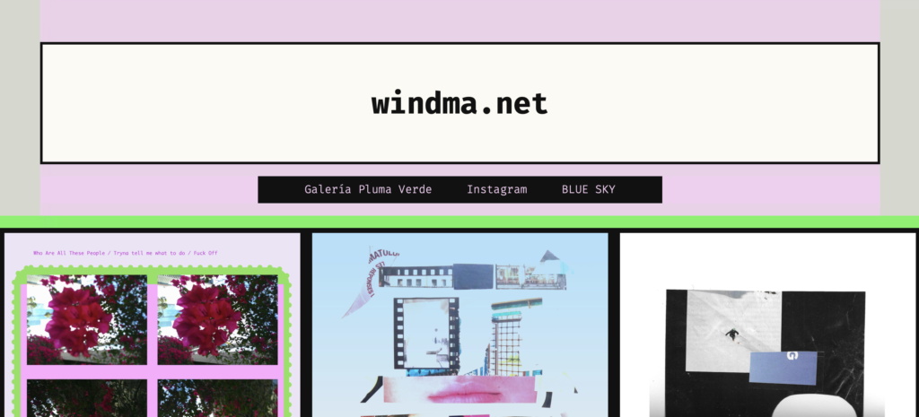
WindMa.Net is now live!

Hello Everyone! It’s been a while since I’ve posted here. Mostly I’ve been busy with life; however, I’ve also set up a dedicated art portfolio—which is now live! You can check it out at windma.net.

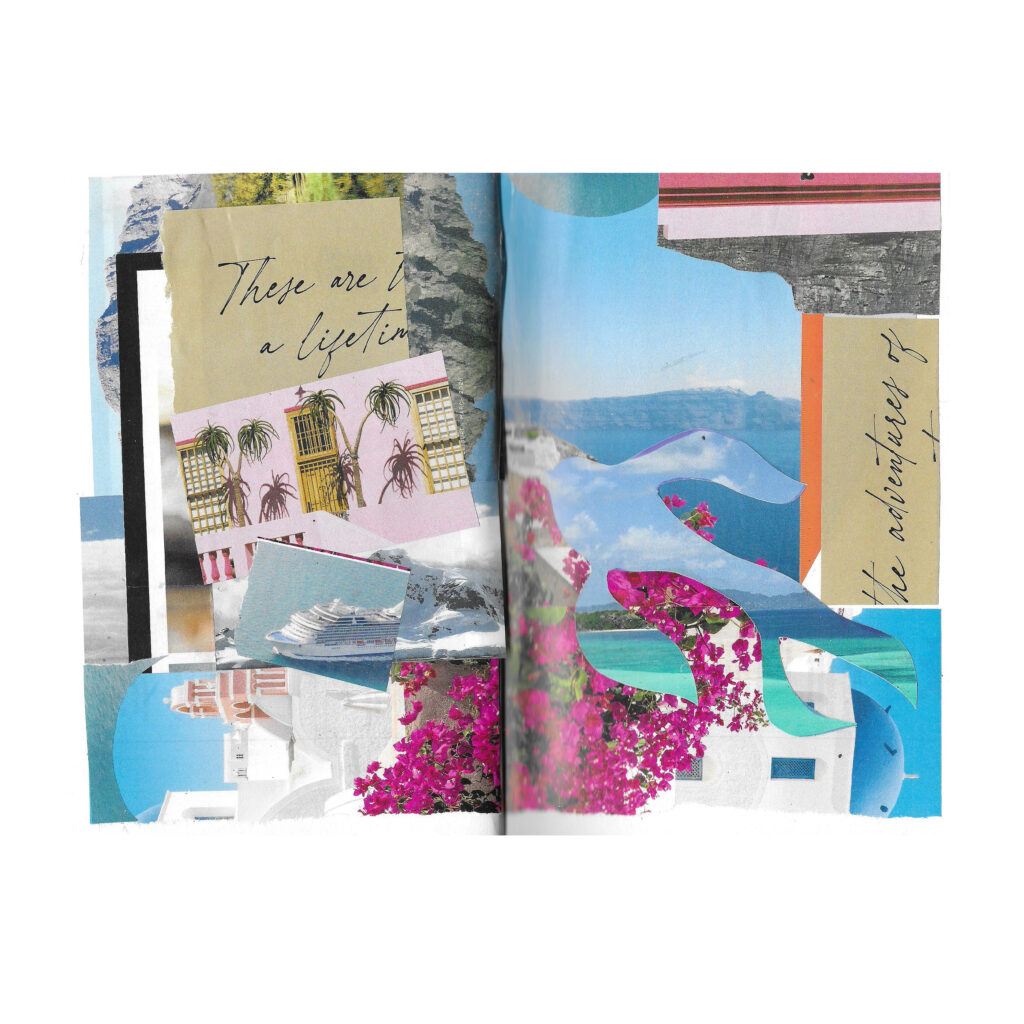
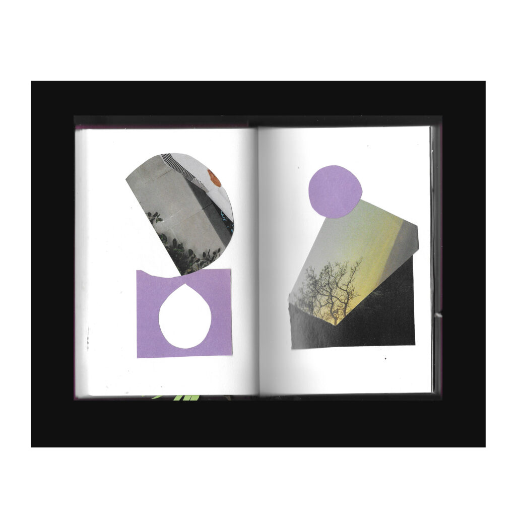
After working on the Collage 26 hardcover prototype, I was emboldened to expand it into a full-length photobook, eponymously titled “Collage 26.” While working on it, I had the chance to think about what motivated to engage with collage. At the risk of waxing philosophic, to me collage-building inspires me to think about how memories (or dreams) are made. In this context, sensory experiences are like the building blocks that become assembled into fuller perceptions.

It is said that, when you remember an event, you are not recalling the actual memory but a memory of a memory. The type of collage work that I do seems to explore that idea, since the image is essentially constructed from random bits and pieces that eventually become full visual forms. At some point, the idea itself becomes assembled; this idea has a bit of memory, a bit of imagination—a bit of present moment, combined to form a work that can be interpreted myriad ways.

Digital photography functions in a similar way. One captures a specific moment; a particular perception, brought about by a state of heightened awareness. When one takes a photo, one is increasingly aware of the transience of life. So working with a photograph, the original idea is evoked, as well as one’s interpretation—could be of the original mood tied to the original moment, or the one that emerged on revisitation. Of course, there are myriad shades of perception driving that photographic transformation. But, for me, digital art follows that line of thinking.

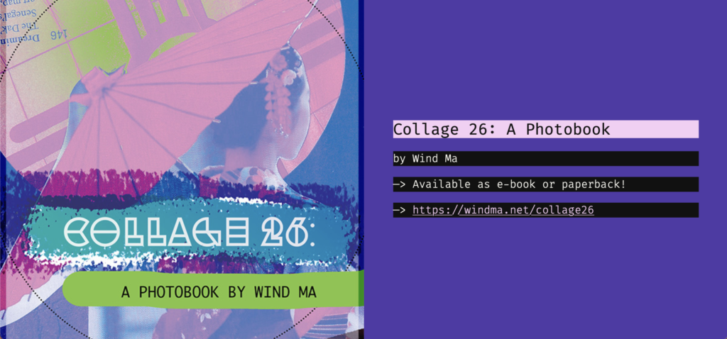
So anywho! Collage 26 is now officially available through Amazon, as both e-book and paperback.

The e-book is currently FREE until May 28th!

The paperback is currently available at $14.99. I wish I could lower the price but, a lot of effort went into this artwork! Mostly I originally conceptualized Collage 26 as an exhibition contained in a book, so the paperback is the culmination of that endeavor. Of course, the same experience could be had with the electronic book, but we already stare at so many images through so many screens… a paperback exhibit is a nice change of pace.


Feel free to send me your comments, questions, or reviews (I would really appreciate this latter—!!) to hello@robmarielopez.com. Or, better yet, send them to Wind Ma at contact@windma.net. You can also follow (her) on Blue Sky! @windmanet.

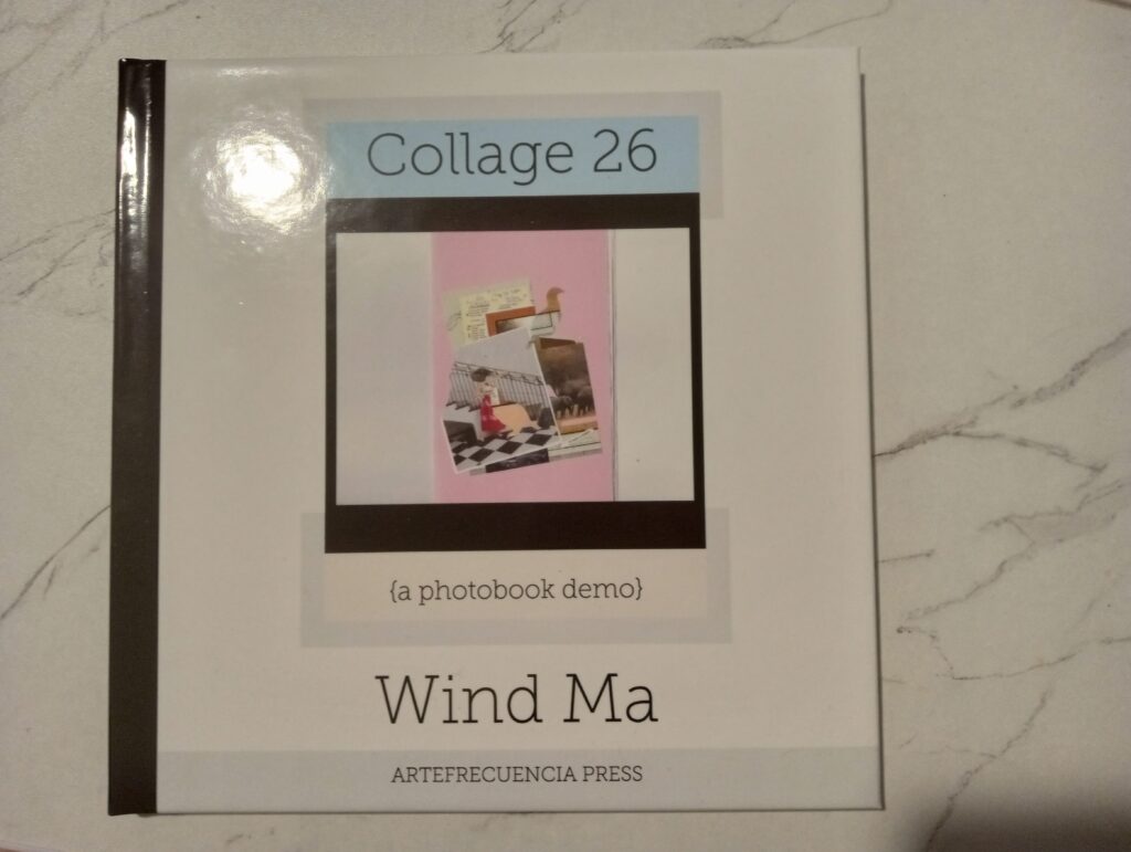
Collage 26 (Demo) by Wind Ma

Wind Ma, Collage 26 (Photobook Demo), Hardcover, 2026.

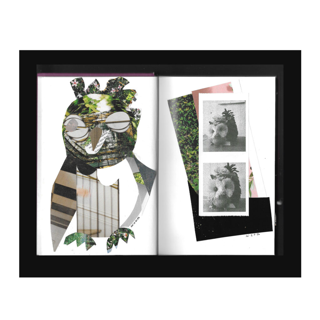
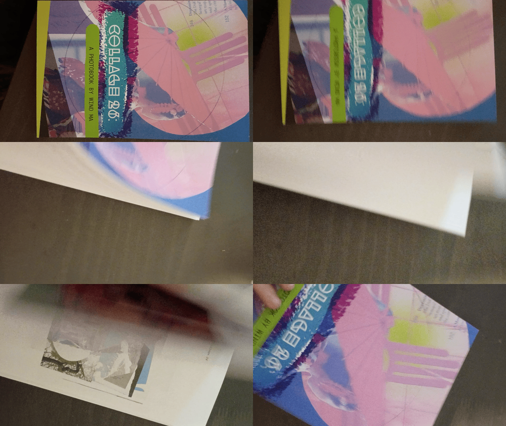
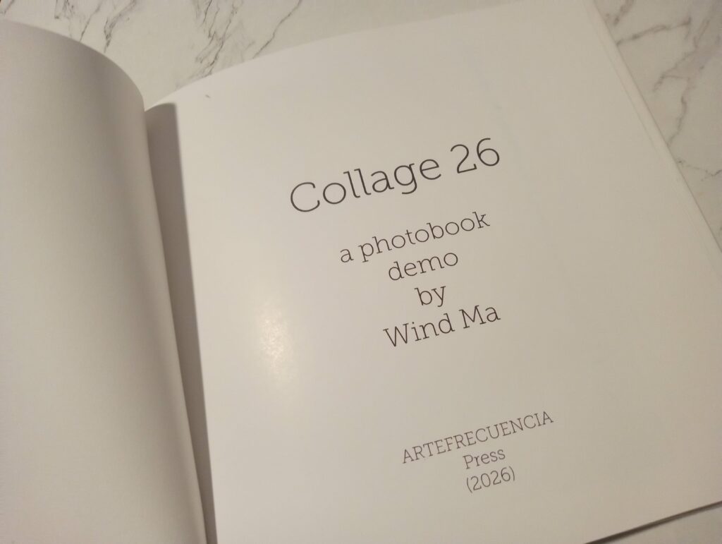
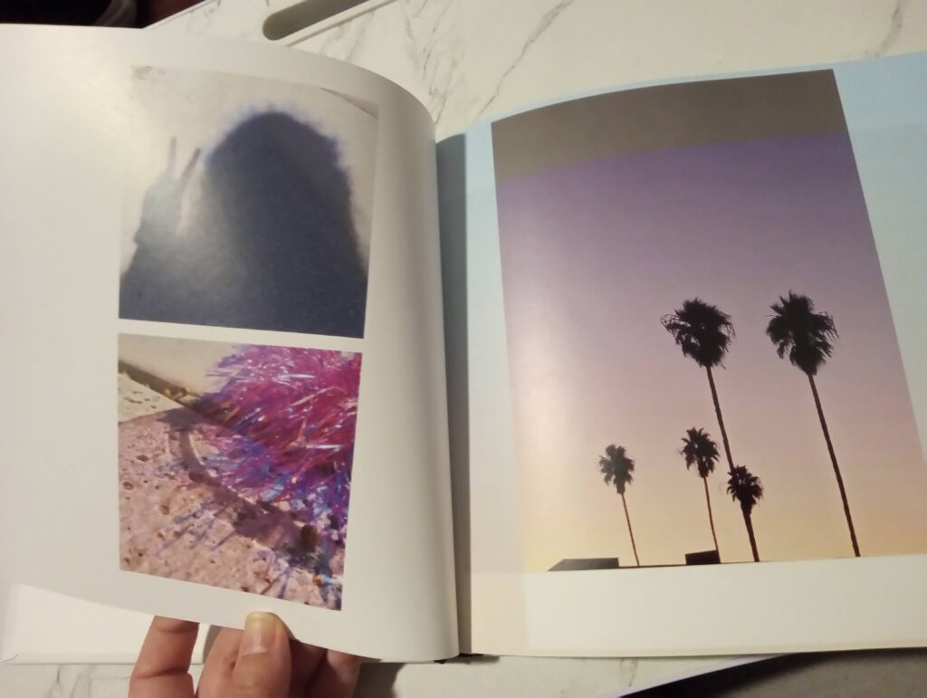
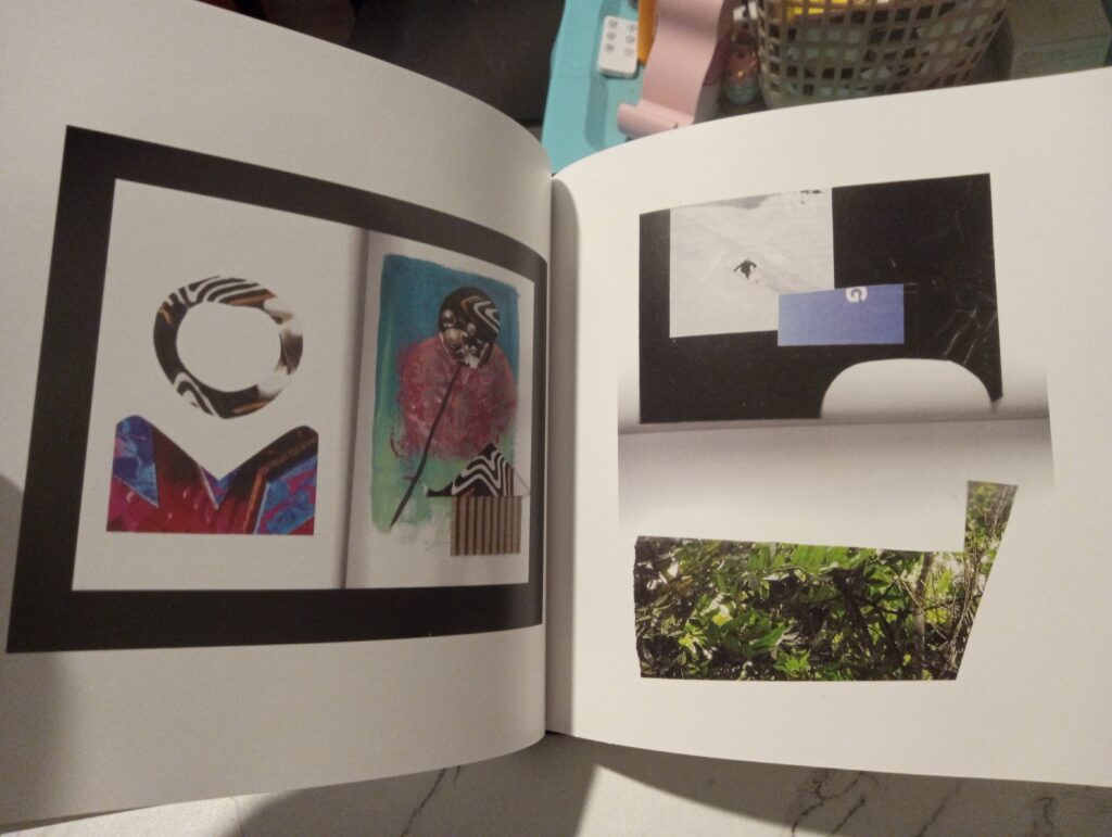
Hello Everyone! I’m live from the studio today, with some good news: my photobook demo arrived not too long ago, and it looks pretty amazing! Collage 26 is a hybrid album: part photo, part collage, where collage is conceived as a photo from a dream world; a snapshot of a mood, an idea, an emotion, a cognition… wherever I happen to wander; the decisive moment exists between the outer world and within.

I’m pretty excited about the concept, and so I might release a fuller album sometime in the near future. In the mean time, check out some stills and snaps from the demo:

Run First, Fly Later

“Run First, Fly Later” mug created by RL a.k.a. Wind Ma
for personal use. Source: Author

Hi Everyone! Happy Easter, if you celebrate 🙂 I am more so like a leaf twirling about in the wind when it comes to these things, but! I was pleasantly surprised yesterday:

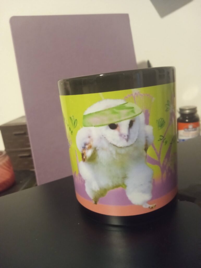
I finally received my “Run First, Fly Later” mug in the mail!

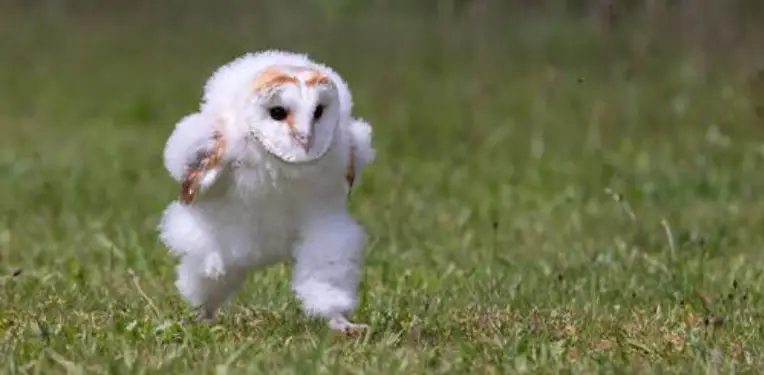
This design started a few weeks ago, after learning that baby barn owls
run before they fledge. The original photo was taken by Hannie Heere,
an amateur photographer with a penchant for wildlife.

Baby Barn Owl Running by Hannie Heere. Source: Green Living Tribe

Heere said that she snapped the photo from about 16 ft. with a Canon 5D Mark IV, using a 70-200mm lens. She was laying on the ground.

“This young bird could not fly yet and was not afraid,” she told PetaPixel.

Imagine snapping a photo like that as an amateur! Coolness indeed.

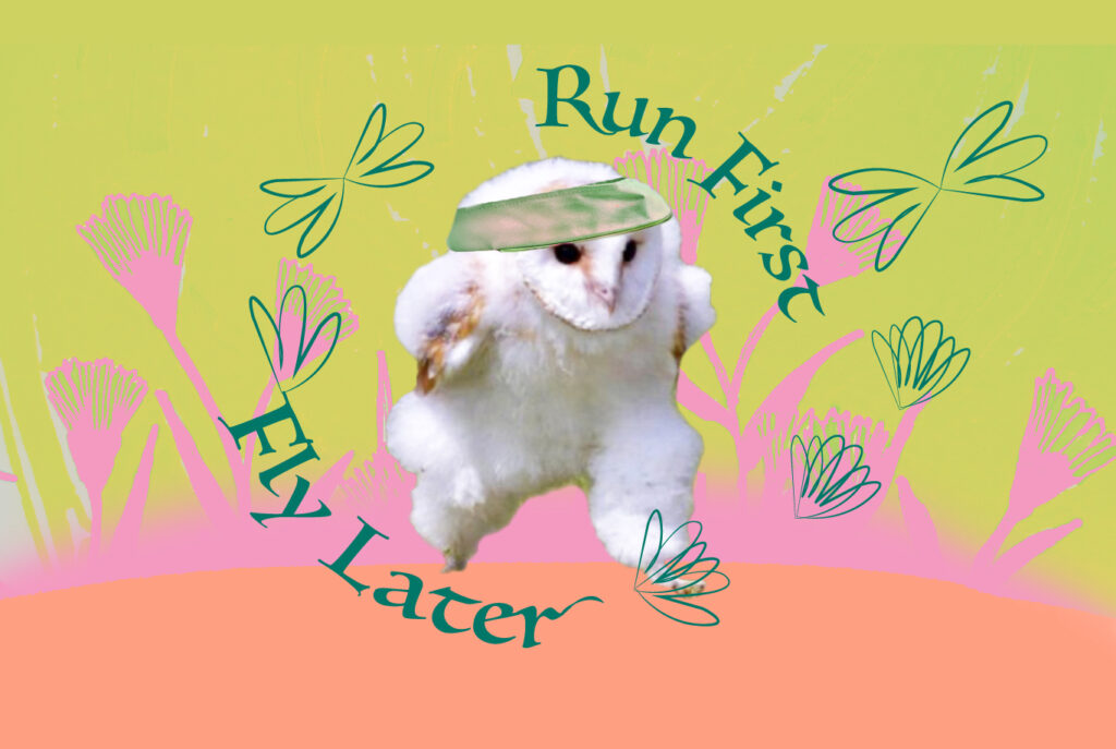
Being smitten as I am with owls—and especially their “sneaky” ability to run, I was inspired to create a wallpaper based on Heere’s photo. It was mostly an off-the-cuff thing, driven by inspiration. It occurred to me that so much in life is like that: one needs to walk before learning to run; one needs to run before learning to fly.

Maybe that’s part of the reason why Heere’s photo is so interesting: she captured one of life’s essential maxims in action.

(Bonus points for cuteness!)

“Run First, Fly Later,” wallpaper by RL, a.k.a. Wind Ma.
Running owl photo by Hannie Heere.

Well, as a celebration of life, baby barn owls, and Hannie Heere’s photo,
I am making this wallpaper available for all to download 🙂

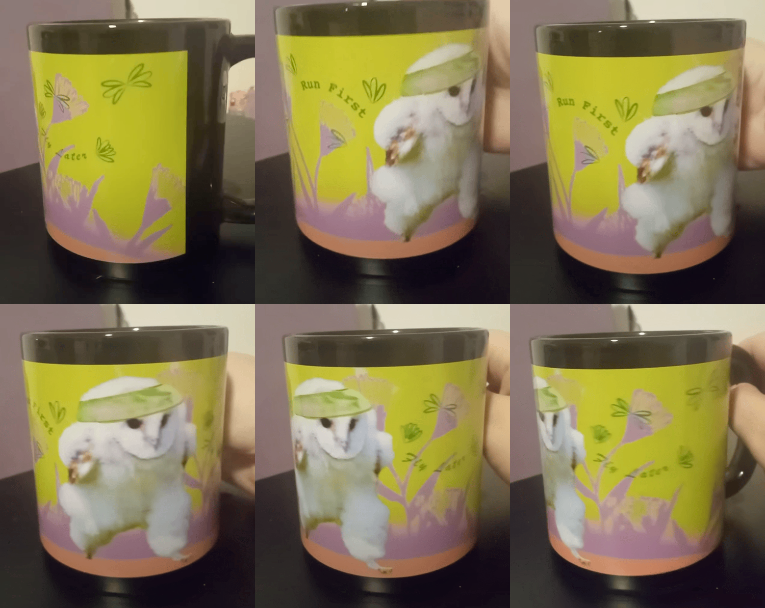
I became so happy with the wallpaper that I decided to make a mug out of it. It took some adjusting of the design for better fit into the longer mug template, but I think that it turned out pretty cool!

“Run First, Fly Later” coffee mug, designed by RL a.k.a. Wind Ma.
Turned out pretty good! 😀
Owl photo by Hannie Heere. Mug designed for personal use only.

The mug was designed for personal motivation (LOL) and is currently unavailable for purchase. Nevertheless, I’m grateful that such a cute moment was captured on camera, making barn owlets a fun source of motivation for years to come.

Art now at Galería Pluma Verde

Greetings Everyone! Happy end of March! I was just thinking about how March always seems so endless to me. Today feels like March 32!

Anywho, I bear happy tidings. Those who know me in some capacity know that I’ve always dabbled in the arts. One of my dreams was to become a professional graphic designer, and while I was unable to pursue it after high school (though I spent many a teenage hour on Paint Shop Pro :D), I was able to find my way back to it in recent years, finally earning a credential in Graphic Art and Design from Rio Hondo College in 2022.

Well, while graphic design is not art, it certainly helped with the way that I approached my expressive-type of art. After a year of applied, dedicated study (and another in art history), I felt a bit more confident in embracing the style of art that became synonymous with Wind—that part of me that struggles with calling herself an artist but who likes to create art just the same.

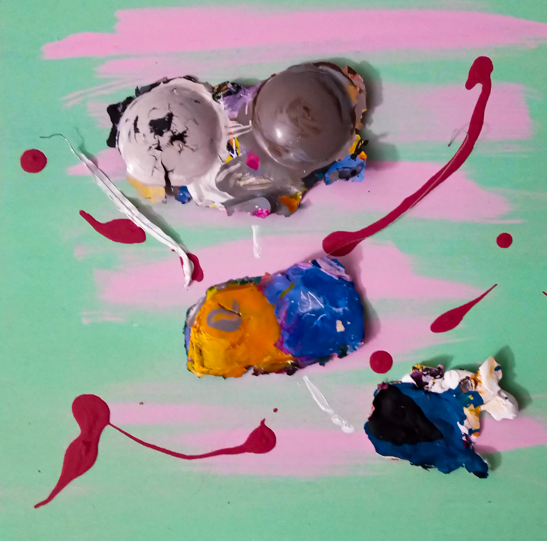
Wind Ma, Mantis (or “After Enlightenment”), 2024, acrylic, metal and gesso on
wood panel, 9.5” x 9.5”. Galería Pluma Verde.

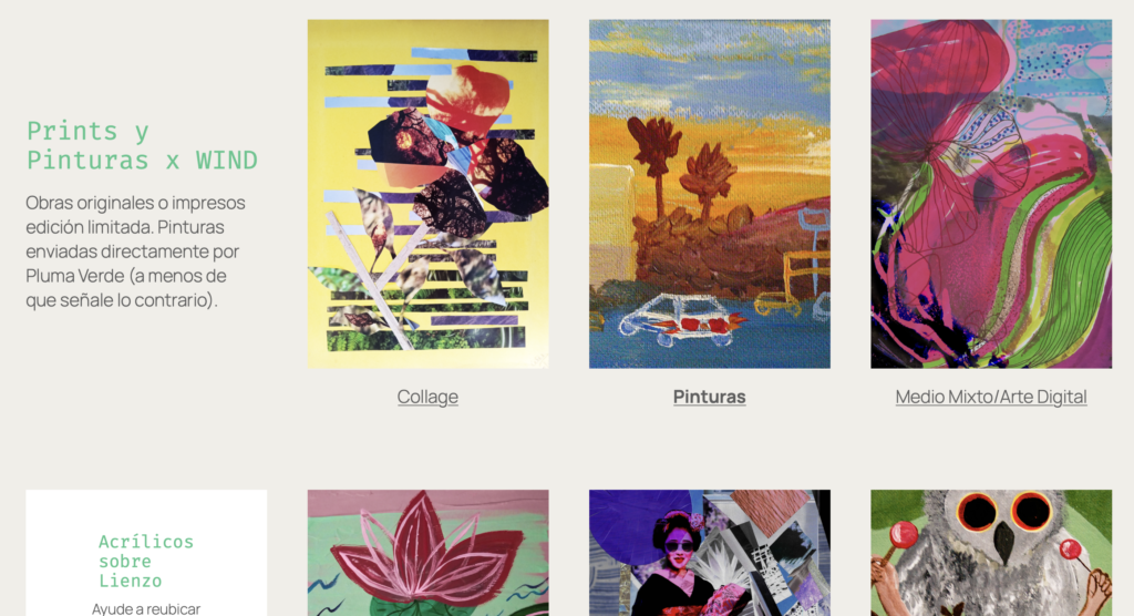
While my works currently span styles and mediums, I’m especially fond of the paintings section, which as of now has five works available for sale. Mostly, I’d like for them to find their “forever homes,” if you will. I currently live in LA, but who knows what tomorrow will bring. To my amazement, I’ve somehow amassed a small collection of Wind paintings, which are now ready to find their way out into the great wide world, into the lively walls of a welcoming abode.

Anywho! Let us see what this crazy venture brings! 😀 More paintings should become available for sale within the next couple of weeks,
so stay tuned.

To learn more about Wind at Galería Pluma Verde:

https://edicionesplumaverde.com/pinturas-x-wind/

If you’d like to reach out about a work, you can e-mail me at:

hello@robmarielopez.com.

Cheers! 🥂

-RL

Happy Spring!

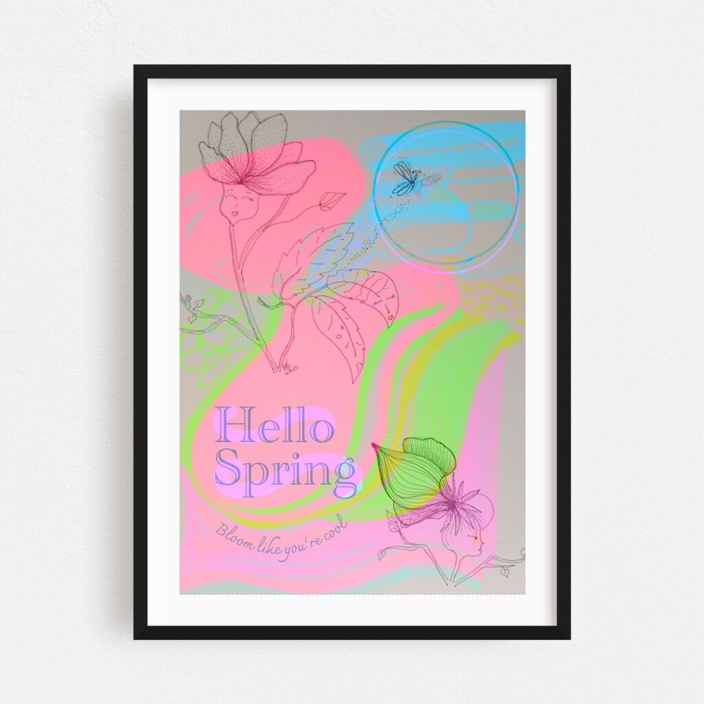
“Hello Spring!” Prints available at pluma-verde.framer.art.

Happy Spring! At least, that’s what the calendar tells me today. With the way that this heat wave is going, you would think that we’re right in the middle of a brutal August!

However, Spring it is, and grateful we are for the shift away from the cold nights of Winter 🙂 (Though it’s easy to miss the natural A/C of February weather).

Anywho! I was so looking forward to Spring this year, that I made—and finally launched!—a commemorative print through pluma-verde.framer.art.

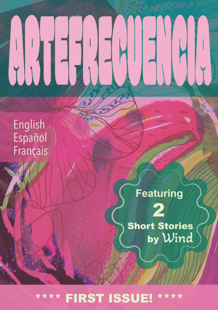
“Oh, interesting!,” you might say. “And why Pluma Verde and not, say, ‘robmarie-lopez.framer.art’?” You might ask. Well, thank you for asking, dear reader! Actually, I originally set up this account as a little shop for the art featured in my published books—or, the books published through my small indie editorial, Ediciones Pluma Verde. The selection was mostly in Spanish until a few days ago, when I finally published ARTEFRECUENCIA, a multilingual arts and letters magazine with a few illustrated short stories and other cool stuff.

The cover for ARTEFRECUENCIA Issue #1, available as a download for the Kindle.
A sample is available for preview at Ediciones Pluma Verde. More to follow!

In light of the fact that there’s a lot of cool stuff that I’d like to share on Framer, the selection has slowly expanded to include non-book related art—which is a plus! Working with art for publication has given me the opportunity to remix works, create new ones, and engage with more creative experimentation overall.

So check out ARTEFRECUENCIA and pluma-verde.framer.art if you can, and let me know what you think in the comments below! You can also say hello@robmarielopez.com.